June 26 2025
New claims management experience
We’ve made substantial changes to most aspects of claims management. It was essentially a complete rebuild, aimed at delivering a superior experience. For full details, refer to the dedicated release notes.
Smoother navigation all around
The extra button that used to appear next to the “three dots” on many screens has been removed. Based on user feedback, we realized that having both was more confusing than helpful. All available options — now cleaned up — will be found inside the “tree dots” menu.
You won’t have to make an extra click to get to the option you want, as the menu will come up automatically when you hover over the “tree dots”.
Reimagined bill view
The release notes for the new claims management experience describe updates to billing-related features, including the redesigned layout when accessing individual bills. The layout for non-insurance bills was also renovated:
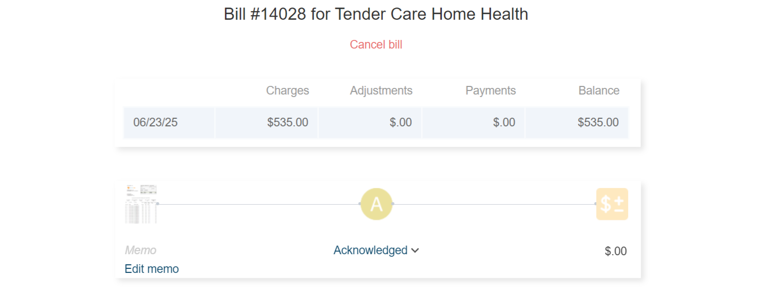
Everything you need to know about a bill — and any actions you may decide to take — were combined into a single, user-friendly page. The invoice, bill status, and itemized payments are presented as points along a horizontal line. You can open each by clicking on the corresponding point. For example:
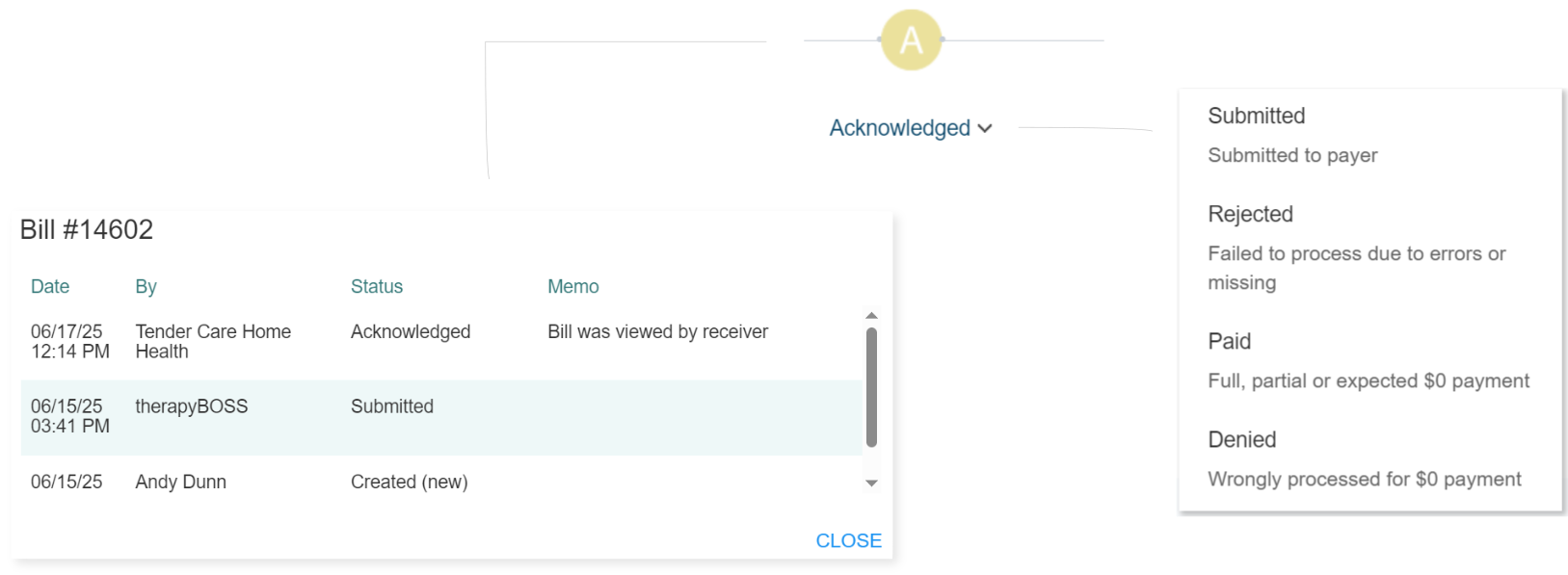
Billed visits will continue to be listed, following the construct shown in the illustration.
One important change to existing behavior: when a referral source views your bill for the first time, therapyBOSS will transition its status to “A” (Acknowledged), so you’ll be aware that it has been seen. Consequently, we recommend not manually assigning the “A” status.
Payment recording makeover
Recording payments, including those covering multiple bills, will offer a completely fresh look and feel. The updated design will help minimize your effort without introducing a learning curve.
Revisions to payment methods
What was previously labeled as ACH was renamed to EFT, an encompassing term for various types of bank transfers. Additionally, “Cash” was added as another payment method.
Decluttered patient chart
Patient charts often contain a large amount of information. The area around the patient's identification, demographics, and contacts tended to become crowded, affecting usability. We’ve addressed this visual clutter by reorganizing demographics and contacts into separate bocks:

You’ll be able to click on each block to update the corresponding information.
Insurance payer settings streamlined
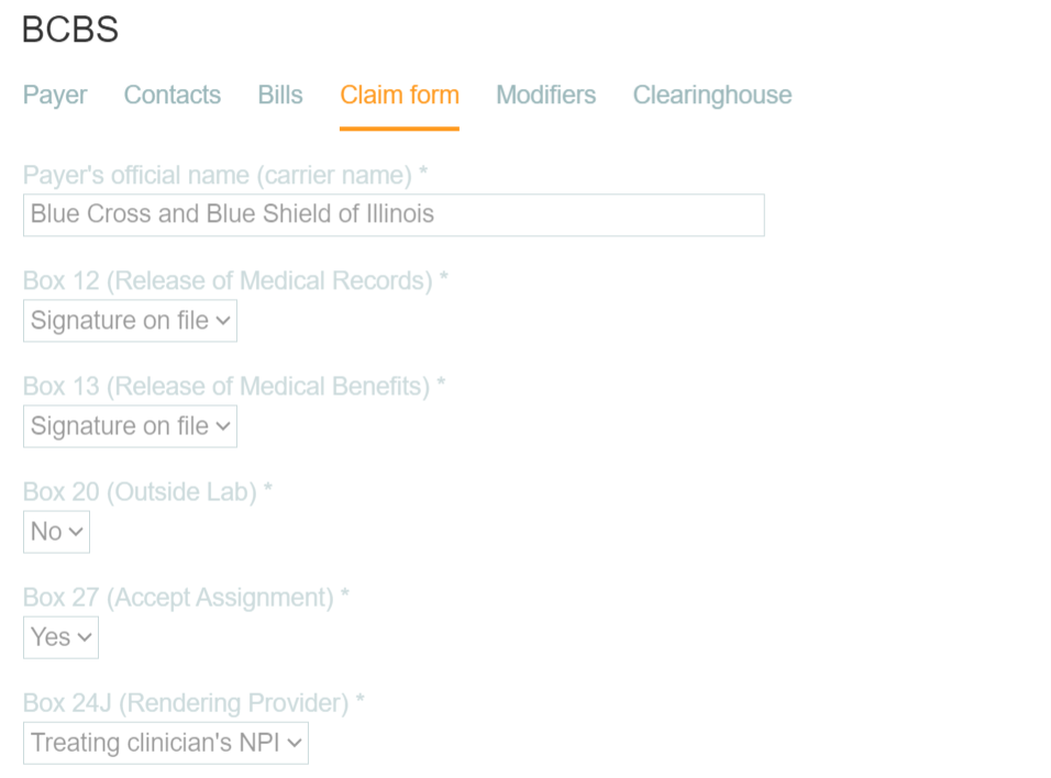
Editing insurance payers will launch a modified dialog that's more intuitive and easier to use. Tabs were rearranged and settings in them redistributed to improve clarity.
Tracking when patients open their bill
therapyBOSS will automatically change a patient’s bill status to “A” (Acknowledged) once it’s looked at through the patient portal:

Therefore, we recommended not setting this status manually unless your clients are not using the portal.
Enhanced clinical note interface
The floating button when viewing clinical notes gave way to a tollbar that embeds all available options, making them more readily accessible:
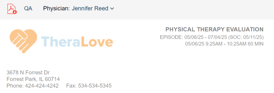
Notice that physician selection is located in the toolbar as well.
Progress toward goals displayed horizontally
Compatible notes will allow you to see progress toward goals formatted horizontally instead of in columns:
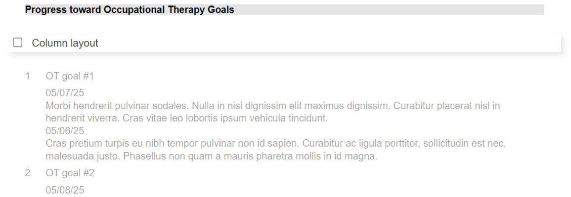
therapyBOSS will remember your preference and apply it to all instances of progress toward goals, displaying it the same way for clinicians when viewed in the web app.
The latest update to the clinician apps enables clinicians to edit progress toward goals. They can leave the content as compiled automatically (based on treatment documentation), revise it, or fully replace it with their own.
Additional filters for referrals history
The Referrals history section will include two new filters: Episode type and Service.
Create payroll loading faster
Visits will load faster when navigating to Create payroll thanks to targeted improvements in this release. In some cases, especially with high visit volumes, loading may be two to three times faster.
Refined history of payroll
The history of payroll screen incorporated a number of visual elements — menu tabs, title, payroll totals, buttons, and view toggles for Clinician and Activity — resulting in a visually busy layout. We shifted these elements around to create a lighter, cleaner presentation:

