June 26 2025
Smoother navigation all around
The extra button that used to appear next to the “three dots” on some screens has been removed. Based on user feedback, we realized that having both was more confusing than helpful. All available options — now streamlined — will be found inside the “tree dots” menu.
You won’t have to make an extra click to get to the option you want, as the menu will open automatically when you hover over the “tree dots”.
Decluttered patient chart
Patient charts often contain a large amount of information. The area around the patient's identification, demographics, and contacts tended to become crowded, affecting usability. We’ve addressed this visual clutter by reorganizing demographics and contacts into separate bocks:
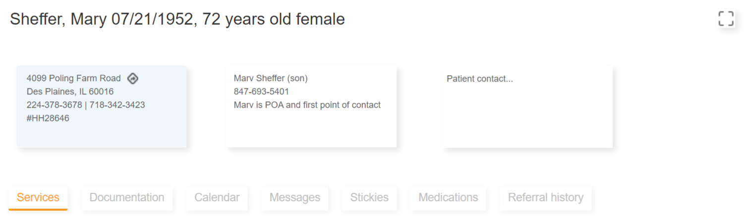
You’ll be able to click on each block to update the corresponding information.
A new button has also been added in the top-right corner. Pressing it will maximize the patient chart area for added convenience.
Enhanced clinical note interface
The floating button previously used when viewing clinical notes was replaced with a tollbar that presents all available options, making them more readily accessible:
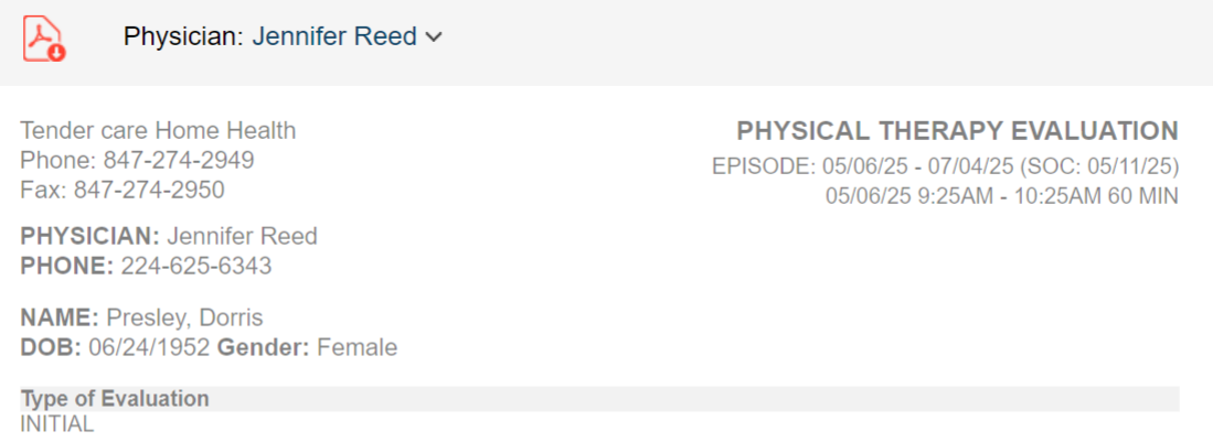
Notice that physician selection is now located in the toolbar.
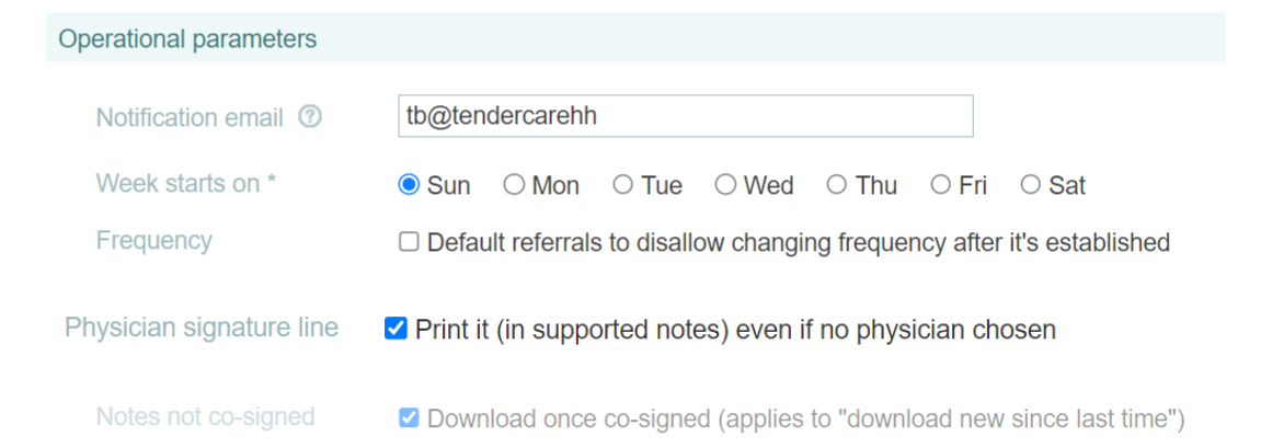
Forcing physician signature line
When downloading notes, therapyBOSS previously included the physician signature line only if the note had an assigned physician. While it’s best practice to add a physician to referrals, you can configure therapyBOSS to always print the signature line: